Backrooms后室:代码教程
本篇教程以全站CSS内容为基础。
你亦可参考CSS使用指导为单个页面定制CSS。
该版本教程基于FBRCN代码教程2023/8/10版本进行修改,遵循CC BY-SA3.0协议授权使用,目前正在根据本站的本地代码修缮中,欢迎您前来补充!
若您在查找更基础的wikitext教程,请参考旧版代码教程。
嗨,欢迎来到这里,无名的流浪者!
认真阅读本篇文章,你将会在这里学到一些代码的基础与进阶用法。
希望这对你的创作有所帮助。
在常用的语法要点处,会使用红色标题高亮,就像这样。
正常的标题用深青色高亮,就像这样。
请记住本文的最后更新时间,以便在本页更新后及时获取新代码的使用方法。
本文搭配个人沙盒使用更佳!你可以在那里同步测试学到的代码哦~
你觉得这个这个字体挺好看的?后面就会教你怎么使用的啦( ̄▽ ̄)~*
如需代码支持,请在创作交流群中咨询或在这里留言(๑╹◡╹)ノ"""
以下为本文目录:
一、序章
你应知道的事
本站使用Wikitext,一种简化后的HTML。
JavaScript脚本也能够在这里运行,但较为特殊,在此不多做介绍。
本文写作思想
出于易于使初学者理解的思想,本文会使用比较简单的“比喻”或例子,它们难免有一些纰漏。如果你无法理解这些内容,不必过于深究。
另外,本文写作对象主要是后室写手,并不会太过深入地涉及Wikitext/CSS的使用,只会涉及有助于基本写作方面的内容且尽量使用较简单、易理解的代码,如果你想更多地了解CSS/wiki网站开发,请自行百度。
二、基本Wikitext与页面布局
中括号“[]”
中括号里一般放置链接,常用的有以下两种:
- [[页面]] & [链接 页面]
- [[file]]
[[页面]] & [链接 页面]
这种使用方式是将一个页面引到另外一个页面的传送门。
如果引用页面存在于本Wiki,那么你只需要复制那个Wiki页面的专用后缀那里,然后粘贴到一对双英文中括号中间,它就会将点击链接的人引到那个Wiki页面。举例:
代码示例 1-1
专用后缀:https://wiki.biligame.com/backrooms/Level_0中,Level_0是页面专用的后缀。你想要跳转到这个页面只需要[[Level 0]]。
(网页中,专用后缀中包含下划线“_”,但实际引用时下划线可以替换为空格。)
但如果不是本Wiki的页面的话就相对麻烦一些:你需要用空格把要引过去的链接与显示文本分隔开,若无显示文本则会显示为“[1]”这样的形式。举例:
代码示例 1-2
[[file]](媒体导入)
一般是放置一张已经从主站导入的照片或视频或什么奇奇怪怪的文件时使用的,举个例子,如果我想把Media:Site-logo.png这个已经上传到wiki的文件导入到我的页面中,我只需要这样:

代码示例 1-3
嗯……是不是有点丑。对于图片导入,我们可以通过尺寸指令、样式表指令、对齐指令等来调整它,直接将指令插在中括号里面,用“|”分隔就可以了。
尺寸指令即“**x**px”,其中两个**分别指图片的宽度和高度。
样式表指令可以调整图片的展示格式,包括thumb(缩略图)、border(加入边框)等。
对齐指令可以调整图片的展示格式,包括right(居右)、left(居左)、center(居中)等。
另外,如果单独加入一段文本,这段文本会作为图片的描述文本,会在鼠标悬停在图片上时(非缩略图)或图片下方(缩略图状态)显示。
下面是一些例子:
代码示例 1-4-1
代码示例 1-4-3
这样子的话我们现在就可以向楼层里面放描述照片啦!通常楼层的描述图片都是缩略图~
另外,当对齐指令为left、right或没有时,图片可以与文字共存,就像下面这样:
现在看左边,照片就已经放进文字栏了,而且它可以放置到我任何想要放置的位置,像这样:,这样你就可以无缝插入了。
有些文档中还会包含更高级的图片插入方法,具体可以参见#Blurimage章节!
总标题、段落标题
总标题是指在文章页眉处显示的大标题。它默认是你创建的页面名(即网页链接中……zh/wiki/后的部分)。你可以使用下面的代码来更改文章的总标题:
{{DISPLAYTITLE:标题名}}
段落标题是指在文章不同内容前的加的标题,用以区分不同的表示内容。它有着不同的级别,我们分别称之为一级标题、二级标题、三级标题、四级标题、五级标题(没有六级标题)。如你一般所见文章中的“描述”、“出口和入口”等字,即为二级标题;而在“出口和入口”内的“出口”、“入口”即为三级标题。一级标题是与总标题一样大的标题,一般不使用。
段落标题可以用“=”(英文等号)来召唤,几级标题就是几个等号,例如:
二级标题: == 内容 ==
三级标题: === 内容 ===
需要注意的是,段落标题必须独占一行才能成功召唤,也就是说,在源代码编辑模式中,他前面不能有内容(<br>也不行),后面也不能有内容。
“*”/<li>(列表)
类似段落标题,你可以使用不同数量的“*”来召唤不同的小叙述项,例如:
* 下面是几个我比较喜欢的楼层:
** Level 0
** Level 1
** Level !
- 下面是几个我比较喜欢的楼层:
- Level 0
- Level 1
- Level !
代码示例 1-5-1
与段落标题类似,这玩意也只能独占一行才能成功召唤。
你还可以使用<li> 内容 </li>来快速达成和使用“*”类似的效果(并不完全一致,比如用li召唤的点前面没有空格),而且它还能加style属性标签。但请注意,<li> 的叠加使用不能分级,例如:
<li style="color:red;"> 这是第一段话 <li style="color:blue;"> 这是第二段话 <li style="color:grey;"> 这是第三段话 </li></li></li>
代码示例 1-5-2
Category(标签)
△ 如果你的文章为楼层,请在源代码编辑模式下在文中加上 [[Category:楼层]]与[[Category:神话楼层]] 以表明你的文章类型。
△ 如果你的文章所写楼层为异常楼层(楼层编号不为数字或特殊楼层名),请在源代码编辑模式下在文中除了“楼层”的两个标签以外再加上(任意位置均可) [[Category:异常楼层]] 以表示这是一个异常楼层。
△ 如果你的文章所写楼层为负数楼层,请在源代码编辑模式下在文中除了“楼层”的两个标签以外再加上(任意位置均可) [[Category:负数楼层]] 以表示这是一个负数楼层。
△ 如果你的文章所写楼层为亚层(或称子层),请在源代码编辑模式下在文中除了“楼层”的两个标签以外再加上(任意位置均可) [[Category:亚层]] 以表示这是一个亚层。
△ 如果你的文章所写文为物品/实体/理论/组织/……,请在源代码编辑模式下在文中加上对应的标签,比如 [[Category:物品]] 。
楼层索引的使用
你可以通过使用Redirect模板来索引临近序号的两个楼层,比如你的楼层是Level 37,那么你可以指定它索引到Level 36与Level 38。举个栗子:
{{Redirect|Prev=36|Next=38}}
你可以去Level 37的页尾查看这个例子的效果。
目录显示开关
在文章中插入 __NOTOC__ 即可关闭目录显示;
在文章中任意位置输入 __TOC__ 即可在这里召唤目录(如果你没有关闭目录显示的话)。
空行与分割线
或许你也经历过被Fandom的空行判定逼疯的时候:你明明按了回车,但是预览文本发现连在一起了。
这时候,我们就要请出<br>来辅助空行了。有了它,你甚至可以不用按回车,做到一篇文的所有代码和文案都堆在一坨。
分割线有时对页面美观有着重要作用。
分割线の召唤方法:使用----(需要独占一行)或<hr>召唤即可。
分割线后面的内容会被自动挪到下一行。
分割线的例子(就是下面这个横线):
三、模板的使用
{{Background}}(页面背景设置)
如果你想为你的页面增加一点氛围感,设置一个与众不同的背景是一个好的选择(〃´-ω・)
你可以通过Background模板来便捷地设置背景,格式如下:
{{Background|{{filepath:xxx.png}}}}
无论你的图片多大,它都将自动适配你的屏幕大小。
{{Blurimage}}(高级图片描述)
如果你有注意Level 0等楼层的图片,你会发现它们的图片与直接使用[[File]]插入的不一样,这是因为这些图片使用了Blurimage模板。以下是一个示例:
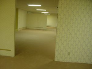
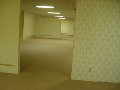
代码示例 2-1
有了Blurimage,在页面中展示的图片就变得更加美观了!
用法:文本折叠
本Wiki内置了{{Collapse}}模板,它能帮你简化MediaWiki原有的折叠代码。
下面是{{Collapse}}模板的使用格式:
附注
不难发现,如果你点击body中的“这是第三句话”,你是不能收起这个折叠模块的。这就是final内容与body内容的区别。num=1是用来防止与后面的折叠内容重复的,如果两个折叠内容的num都=1,那么你点开第一个折叠内容,第二个折叠内容也会开启。
这是第三句话
代码示例 9-1
需要注意的是,在{{Collapse}}模板中添加Wikitext表格代码(即{|……|}),其中的“|”会被误解析为Collapse模板的分隔符。
故若要在此模板中嵌入表格,请使用<table>标签或将“|”用{{!}}替代或嵌入另一模板。
样式:折叠密码模块
一些"传说"等隐藏内容较多的页面包括一个假的"登录"框,提示用户输入密码。但其实不需要真正的输入,因为点击该框将显示下一节内容并自动填充密码。这可以通过下面这一长串代码来实现。
<div style="background-color:white; color:#AAAAAA; margin:1em; padding:5px 10px; border:2px solid #000000; border-radius: 3px">
<span class="mw-customtoggle-password mw-customtoggle-password2"><div class="mw-collapsible" id="mw-customcollapsible-password2">输入密码</div></span>
<div class="mw-collapsible mw-collapsed" id="mw-customcollapsible-password"><div class="mw-customtoggle-password mw-customtoggle-password2"> 示例密码</div></div></div>
<div class="mw-collapsible mw-collapsed" id="mw-customcollapsible-password"><big>已自动填充已缓存密码,欢迎 {{USERNAME}}。</big><br /><br />[示例内容]</div>
在实践中,这段代码会产生这样的结果:
[示例内容]
当然,你也可以对这个折叠样式进行进一步的美化,如下所示:(来源:员峤)
[[File:Site-logo.png|right|215x215px]]
<div style="background-color: #FAFAD2; margin:1em; padding:5px 10px; border:2px solid #000000; border-radius: 3px">
'''警告:'''<br>
<code>以下内容已被M.E.G.加密,请输入有效凭证。</code>

'''原因:''' <code>你并未获取浏览这个文件的许可,它要求更高的许可等级。</code>
</div>

<div style="background-color:#FAFAD2; color:#888888; margin:1em; padding:5px 10px; border:2px solid #000000; border-radius: 3px">
<span class="mw-customtoggle-password mw-customtoggle-password2"><div class="mw-collapsible" id="mw-customcollapsible-password2">
输入密码</div></span>
<div class="mw-collapsible mw-collapsed" id="mw-customcollapsible-password">
<div class="mw-customtoggle-password mw-customtoggle-password2">
4R415T51G1Rr4</div>
</div>
</div>
<div class="mw-collapsible mw-collapsed" id="mw-customcollapsible-password">
<br />
<div style="text-align: center><code>'''凭证有效。'''</code></div>
<br />
<div class="mw-customtoggle-first"><span style="color:blue;">'''<code><big><u><div style="text-align: center">> 打开文件</div></u>'''</big></code></span></div><div class="mw-collapsible mw-collapsed" id="mw-customcollapsible-first">[示例内容]</div></div>
效果:
.png)
警告:
以下内容已被M.E.G.加密,请输入有效凭证。
原因: 你并未获取浏览这个文件的许可,它要求更高的许可等级。
凭证有效。
> 打开文件
四:基础HTML的使用
属性盒与属性标签
<div>/<span>/<font>是Wikitext的基础属性盒。它们大体上作用一致,皆起着为盒内文本添加一定属性标签的作用,但个体上还有些许不同。[?]
附注
<b>的效果是将这一属性盒内的文本加粗,完全等价于'''文本'''。在示例1-2中将向你展示使用'''的效果。
代码示例 1-1
代码示例 1-2
通过这两个示例,我们可以很清晰地看出<div> <span>两标签见的主要不同:div会自动换行,而span不会。这是由于,div的主要作用对象为包括文本及其所在的整行背景在内的整体,而span的主要作用对象仅为文本。font标签的作用基本与span相同,也不会使文本间自动换行,故不再举例展示。
选择了合适的属性盒,接下来便需要向属性盒中填充属性标签。
属性标签有id、class、style等多种,它们可以在一个div属性盒中集中召唤。id属性标签不常用,故在此不作介绍。在示例1-1、1-2中出现的style属性标签即为写作最常用的标签。
附注
至于style属性标签里面的那一串东西都是什么意思,请见后面的教程。
代码示例 1-3
请注意,属性盒的结束元素(即</div>/</span>等)可省略,但不建议省略,因为这会影响属性盒的正常表达,导致属性内容混淆。
属性标签: class
属性标签"class"的作用为添加类目,它与“id”的唯一区别就是可指定多个对象,以改变文本的样式。下面是几个栗子:
代码示例 1-4 [黑幕]
附注
将鼠标移到模糊块上试试?通过如此,可以产生一个防剧透(模糊)的效果。你可以将它用于一些加密文件上,但请注意,模糊字的大量使用会严重影响观感。
代码示例 1-5 [模糊字]
属性标签: title
属性标签"title"可以为其中所包含的内容添加一个当鼠标悬停于其上时显示出的文字。坏消息是手机端似乎触发不了,所以不建议使用这个做重要内容。
代码示例 1-6
代码示例 1-7
属性标签: style
属性标签"style"是属性标签中最重要的一部分,也是你的创作过程中一定会用到的内容。你想要给一段文字上色也好,调整位置也好,调整大小也好,更改字体也好,都需要用到这个,每一个style标签中的具体属性都要用到“;”(英文分号)进行分割,比如<div style="color:green;font-family:黑体">这个样子。<br>'''本文第二章内容将就style中的各个可添加属性展开。'''
二、特殊文本样式
color(文本颜色设定)
顾名思义,此属性可设置文本的字体颜色。下面以一个例子阐释该属性的效果:
代码示例 2-1
在示例2-1中采用了颜色对应英文的方式来更改字体的颜色。你还可以通过十六进制颜色码来表示颜色。下面一个例子集合了这两种表达方法:
代码示例 2-2
同样的,你还可以通过rgba方法来表达颜色。下面的例子就使用了rgba方法来显示文字。
代码示例 2-3
font-family(文本字体设定)
可以改变文字的字体样式,俗称字体。
如果这个字体没有被本Wiki搭载,那么只有电脑(ios设备除外)上装有这个字体的人才能看到你设置的这个字体。比如你设置字体为汉仪文黑,那么只有电脑上装有汉仪文黑这个字体的人才能看到(这段话就是这个字体哦,如果你没有装这个字体,那么你看到的应该是设备默认的字体)。所以,不要用你的电脑上安装的字体,别人看不到变化。
如果本Wiki搭载了某个字体,那么所有人(电脑端)都能看到。
以下为本Wiki搭载的中文字体列表:
模板:代码教程/字体列表
其实一些系统中一般自带的字体也可以使用。比如:等线、楷体、宋书等。
此外,还有一些通过外部字体库可以调用的字体,详情请见Freefonter字体库
font-size(文本大小设定)
font-size属性可允许你改变文字的大小。
但你可以使用Wikitext中自带的 <small> 和 <big> 两个独立的标签来调整文字大小。
<big><big>这句话展示的为2个big标签叠加的效果</big></big>
<small><small>这句话展示的为2个small标签叠加的效果</small></small>
这句话展示的为2个big标签叠加的效果
这句话展示的为2个small标签叠加的效果
代码示例 3-1
font-style(文本倾斜设定)
font-style标签准许你变更文本的斜/直显示。可设定项有normal、italic、oblique三种,其中,italic、oblique的效果一般一致,都能使文本倾斜显示,但oblique可以变更文本倾斜的角度(但目前仅Firefox浏览器支持该功能的显示,故不再介绍变更倾斜度的详细用法(实际上你可以使用skew函数达成相似的效果))。
在Wikitext中,你可以用'' ''来代替这个属性。
代码示例 4-1
text-decoration(文本加线设定)
“text-decoration”属性规定了文本的修饰线样式。
建议:
你也可以使用 <u> 内容 </u> 或 <s> 内容 </s>
来简单地召唤下划线(Underlining)/ 删除线(Strikethrough)
使用 <u> 内容 </u> : 内容
使用 <s> 内容 </s> : 内容
附注
属性值中的各项应依次为:修饰线位置、修饰线样式、修饰线颜色、修饰线粗细值。其中,修饰线位置可有多个值。在第一个例子中,修饰线有“underline”与“overline”两个值,即上下皆有修饰线。修饰线位置的可取值有underline、overline、line-through,修饰线样式的可取值有solid、double、dotted、dashed、wavy。
代码示例 5-1
text-align(文本位置设定)
“text-align”属性规定文本的对齐方式。
附注
常用可取属性值有:left、right、center、justify。
代码示例 6-1
cursor(鼠标样式设定)
“cursor”属性规定当鼠标指针悬浮于其上时,鼠标指针所显示的样式。
使用格式为:<code><span style="cursor:样式">内容</span></code>
附注
部分鼠标指针在一些系统中可能显示为一种或显示为默认指针。若要使用,建议选取通用性更高的指针。
help pointer
progress wait
cell crosshair
text vertical-text
alias copy
move no-drop
not-allowed grab
grabbing all-scroll
col-resize row-resize
n-resize(可将n替换为e/s/w/ne/nw/se/sw/ew/ns/nesw/nwse,不再展示)
zoom-in zoom-out
代码示例 7-1
text-shadow(文本阴影设定)
text-shadow可为文字与text-decoration(文本加下划/删除/波浪线等)添加阴影。你可以在一个text-shadow标签中添加多个阴影,阴影值之间用逗号隔开。
<span style="text-shadow: red 0 -2px;">(崩坏风格){{Ruby|Variety is the spice of life.|变化是生活的调味品}}</span>
附注
每个阴影值中的数值依次是:文本在水平和竖直方向的偏移量、模糊半径和阴影颜色值。
(崩坏风格)Variety is the spice of life.
代码示例 8-1
box-shadow(背景阴影设定)
box-shadow 用于在文本背景添加阴影效果。你可以在一个box-shadow标签中添加多个阴影,阴影值之间用逗号隔开。
附注
每个阴影值中的数值依次是:文本在水平和竖直方向的偏移量、模糊半径、模糊扩展半径和阴影颜色值。第一个阴影中的inset的作用是使阴影向内扩散。为便于查看效果,在本示例中添加了一个宽度为100%、高度为140px的同主题色背景。
代码示例 9-1
float(元素位置浮动)
使用浮动可以改变任意元素(包括图像与span标签定义的文本等)在页面中的位置,这对文章的排版起着很大的作用。
举个例子:
浮动实例1
浮动实例2
<div style="background-color:grey;border:solid 1px black;margin:5px;width:318px;height:318px;">
<div style="background-color:red;border:solid 1px black;margin:2px;width:90px;height:90px;">
浮动实例1
</div>
<div style="background-color:green;border:solid 1px black;margin:2px;width:90px;height:90px;">
浮动实例2
</div>
<div style="background-color:blue;border:solid 1px black;margin:2px;width:90px;height:90px;">
浮动实例3
</div></div>
我们可以看到一个大灰框内有三个框框,这里没有设置浮动,所以他们都默认地排在了左边。
浮动实例1
浮动实例2
浮动实例3
<div style="background-color:grey;border:solid 1px black;margin:5px;width:318px;height:318px;">
<div style="background-color:red;border:solid 1px black;margin:2px;width:90px;height:90px;">
浮动实例1
</div>
<div style="float:right;background-color:green;border:solid 1px black;margin:2px;width:90px;height:90px;">
浮动实例2
</div>
<div style="background-color:blue;border:solid 1px black;margin:2px;width:90px;height:90px;">
浮动实例3
</div></div>
如果我们想让绿块排到右边,这时就应该给绿块设置右浮动,它脱离文档流并且向右移动,直到它的右边缘碰到包含框的右边缘。同理可以对红块和蓝块进行同样的操作。
那么此时就发现了一个问题:浮动区域下方有其他区域时,下方区域总是会上移补位。这个问题主要源于被浮动的区域已经脱离了文件,不再占用空间,因此在计算机看来,它们其实是不存在的,所以就用到存在的区域进行补位。
那么如何解决这个问题呢?一般来说,这个问题无法被解决。但是我们可以通过多种浮动的累加,对区域进行自定义排版:
同时对所有区域设置左浮动或右浮动,它们就会依次排序:(这里使用左浮动作为案例)
浮动实例1
浮动实例2
浮动实例3
可以看到三个区域按顺序从左到右依次排好了。
 <div style="background-color:grey;border:solid 1px black;margin:5px;width:318px;height:318px;">
 <div style="float:left;background-color:red;border:solid 1px black;margin:2px;width:90px;height:90px;">
 浮动实例1
 </div>
 <div style="float:left;background-color:green;border:solid 1px black;margin:2px;width:90px;height:90px;">
 浮动实例2
 </div>
 <div style="float:left;background-color:blue;border:solid 1px black;margin:2px;width:90px;height:90px;">
 浮动实例3
 </div></div>
如果按照上述操作设置浮动,包含框太窄,无法容纳水平排列的多个浮动元素,那么其它浮动块向下移动,直到有足够的空间:
浮动实例1
浮动实例2
浮动实例3
 <div style="background-color:grey;border:solid 1px black;margin:5px;width:318px;height:318px;">
 <div style="float:left;background-color:red;border:solid 1px black;margin:2px;width:130px;height:90px;">
 浮动实例1
 </div>
 <div style="float:left;background-color:green;border:solid 1px black;margin:2px;width:130px;height:90px;">
 浮动实例2
 </div>
 <div style="float:left;background-color:blue;border:solid 1px black;margin:2px;width:130px;height:90px;">
 浮动实例3
 </div></div>
而如果浮动元素的高度不同,那么当它们向下移动时可能被其它浮动元素“卡住”:
浮动实例1
浮动实例2
浮动实例3
 <div style="background-color:grey;border:solid 1px black;margin:5px;width:318px;height:318px;">
 <div style="float:left;background-color:red;border:solid 1px black;margin:2px;width:130px;height:130px;">
 浮动实例1
 </div>
 <div style="float:left;background-color:green;border:solid 1px black;margin:2px;width:130px;height:90px;">
 浮动实例2
 </div>
 <div style="float:left;background-color:blue;border:solid 1px black;margin:2px;width:130px;height:90px;">
 浮动实例3
 </div></div>
三、特殊功能使用 [NEW]
样式:Tabbers(横向折叠/标签页)
在较长的页面中,仅仅使用标题来组织可能并不总是合适的。标签页是一个非常强大的工具,它旨在将信息很好地缩减为光滑和可读的块状。
任何东西都可以放在标签页内,包括其他标签页。然而,在使用它们时应该谨慎一些。首先,如果一个页面没有使用标签页,它可能是为了从上到下阅读。然而,标签页让读者在选项卡之间横向阅读,而这种风格可能会发生冲突。此外,选项卡从你的页面中拿走了一些内容,意味着它大大减少了页面的长度。如果你的页面非常长,从上到下都很难阅读,标签页的使用会是一个好处。但如果你的页面在6000个字符以下,你可能没有足够的文字来保证标签页内有足够的文字描述。假设你分别有1000个字符用于标签页外的介绍和结束,而你在标签页内有5个选项卡,每个选项卡内含800个字符,尽管这样你的文字符总数仍然是6000个,但这可能是非常令人沮丧的,因为有人点击一个标签,期望深入了解这个主题,却只看到一个段落。这让人觉得你的页面没有什么内容,即使它有适当的数量,总体上让人觉得半生不熟。
如果你觉得标签页的使用有利于你的页面,请记住,你的文章的标签页外内容也必须有可以吸引读者的要素;如果你的所有内容都挤在一组标签中,整个文就会感觉有点不对劲。一个页面应该有一个有凝聚力的引言、内容和某种文字来结束它。结束语可以是与最终结果相关的内容,如"入口和出口"部分,或其他一些使读者轻松进入页面结尾的内容。如果你缺乏一个明显、有凝聚力的结束语,可能导致读者无法判断你在标签页外的结尾段是否处于某个选项卡中。
下面是一个标签页的使用例子:
<tabber>
|-| 基础描述=
[总体概况]
|-| 额外信息=
[探索日志]
|-| 更多信息=
[一些神秘事件之类的]
|-| 附录=
[c̵̨̲̀̋r̵̠̗̔͗͘͘e̴͖̔é̷̲͇p̸̫͖̪͇̂̂̚ͅy̴͚̞̎̊̋ ̴̧̼̘̚w̷̻̳̏͂̂h̵̯̀o̶̗͋̅̌͌a̷̬̘̻͒a̸̦̻̪̱̎̈́͊͋̔a̴̤͈̿͑͂̅͝ ̸̛̙̬̞̝͊̒̄ş̷̞̗̞̜̽p̷̡̹̼̰͈͒̚o̴̰͐̈o̴̯͚̮̔͐̅k̷̼̝͇̯̯͊̃̿͝y̵̧̜̻͇̌̐̈́͘͝]
</tabber>
效果:
[总体概况]
[探索日志]
[一些神秘事件之类的]
[c̵̨̲̀̋r̵̠̗̔͗͘͘e̴͖̔é̷̲͇p̸̫͖̪͇̂̂̚ͅy̴͚̞̎̊̋ ̴̧̼̘̚w̷̻̳̏͂̂h̵̯̀o̶̗͋̅̌͌a̷̬̘̻͒a̸̦̻̪̱̎̈́͊͋̔a̴̤͈̿͑͂̅͝ ̸̛̙̬̞̝͊̒̄ş̷̞̗̞̜̽p̷̡̹̼̰͈͒̚o̴̰͐̈o̴̯͚̮̔͐̅k̷̼̝͇̯̯͊̃̿͝y̵̧̜̻͇̌̐̈́͘͝]
样式:扫描动画折叠
觉得普通折叠看起来太简单、用惯了?那么不如来试试这个动画模板吧~
{{AnimatedCollaspe|num=xxx|content=这里放内容}}
把你要隐藏的内容(可以有代码)放进去就可以啦~
比如
{{AnimatedCollaspe|content=<font color="0000FF"><center>可恶,这个机密内容竟然被你看到了</center></font>}}
效果(点一下试试):
模因标记触媒检测到生命迹象。即将进行基因组核查。
请注意,你正在进行未经允许的访问
如未拥有指定权限密钥,模因定位将即刻生效
你也可以去AnimatedCollaspe模板页面查看一下实现美化内容的代码,然后复制到你的文里,修改这个动画中的部分内容(一定不要改模板哦!)。如果你不太熟悉代码,使用这个模板即可。如果你想在文中使用多个这个模板,请更改num的值(前边基本格式里的xxx)。
什么?你说有单词拼错了?啊哈哈哈,小问题小问题,不必在意(`・ω・´)
样式:Tables(表格)
表格在某些情况下是有很用的工具,比如你可以将其用于一些相似现象的汇总介绍中。它旨在将数据组织成均匀的方框。下面代码中的背景颜色(#xxxxxx)可以改成你想要的任何十六进制颜色代码。
{| class="wikitable"

! style="background-color: #ccf243" |例 1

! style="background-color: #ccf243" |例 2

! style="background-color: #ccf243" |例 3

! style="background-color: #ccf243" |例 4

|-

| style="background-color: #cfffa8" |分支 1

| style="background-color: #cfffa8" |分支 2

| style="background-color: #cfffa8" |分支 3

| style="background-color: #cfffa8" |分支 4

|-

| style="background-color: #cfffa8" |次分支 1

| style="background-color: #cfffa8" |次分支 2

| style="background-color: #cfffa8" |次分支 3

| style="background-color: #cfffa8" |次分支 4

|}
结果:
| 例 1 | 例 2 | 例 3 | 例 4 |
|---|---|---|---|
| 分支 1 | 分支 2 | 分支 3 | 分支 4 |
| 次分支 1 | 次分支 2 | 次分支 3 | 次分支 4 |
你也可以用表格来给一些文本增加一个简洁美观的文本背景(这与div style中设置的背景不同),如下:
{| class="wikitable"

!这里是表格标题捏


哈哈( ・ω・` )


啊∑(゚Д゚ノ)ノ


气死我啦(•́へ•́╬)

|}
效果:
| 这里是表格标题捏
哈哈( ・ω・` ) 啊∑(゚Д゚ノ)ノ 气死我啦(•́へ•́╬) |
|---|
样式:作者与附注信息块
如果你想在你的文最下方注明作者(或合著人/上传人等),你可以使用Author模板。使用格式如下:{{Author|作者=|图像来源=|附注=}}下面举一个例子:
{{Author|作者=An Average Backroom Writer|图像来源=https://unsplash.com/photos/koy6FlCCy5s|附注=如果你对本文有什么建议,请留言,谢谢!}}效果:
https://unsplash.com/photos/koy6FlCCy5s << 图像来源
如果你对本文有什么建议,请留言,谢谢! << 附注
当然,有时为了方便,你也可以直接使用一个折叠来注明作者信息,就像这样:
{{Collapse|num=666|initial=<span style="color:green">'''> 查看作者与关于信息'''</span>|final=<span style="color:green">'''< 隐藏作者与关于信息'''</span>|body=作者: Backrooms <br>图像来源:https://unsplash.com/photos/xxx}}效果:
作者: Backrooms
图像来源:https://unsplash.com/photos/xxx
五、动画[NEW]
注:该篇教程需要你拥有的前置知识为:加入单独页面的CSS或JS。请和该教程区分开来,此教程允许你创造并不存在于fandom预置css里的动画。更多资料请看这里
一、组成
css动画的格式一般长这样。@keyframes anim-1 {
0% {
effect : value;
}
..% {
effect : value;
}
100% {
effect : value;
}
}
/*还可以这么写*/
@keyframes anim-1 {
from {
effect : value;
}
to {
effect : value;
}
}
/*若当前值为空可以直接跳过写下一个值,praser自己会检测*/
.selector1 {
animation: name duration timing-function delay iteration-count direction fill-mode;
}
/*推荐写法*/
.selector1 {
animation-name: ;
animation-duration: ;
animation-timing-function: ;
animation-delay: ;
animation-iteration-count: ;
animation-direction: ;
animation-fill-mode: ;
}
现在我们将详细介绍@keyframes和selector@keyframes
keyframes,也就是关键帧,是用来描述css动画的。你只需要描述在动画运行过程中关键一帧的信息,剩下的会由浏览器自行处理。
举个栗子。我们有一段文字,它原本是模糊的,只有当你把鼠标放上去的时候才会显现清晰的文字,那么要实现这样的css该如何呢?p.blur-n {
filter: blur(10px);
}
p.blur-n:hover {
filter:blur(0px);
}
这样写的话你会发现当鼠标移走后没有渐变的效果。
@keyframes blur-anim {
    0% {
        filter: blur(10px);
    }
    100% {
        filter: blur(0px);
    }
}
p.blur {
    filter: blur(10px);
}

p.blur:hover {
    animation-name: blur-anim;
    animation-duration: 1s;
    animation-fill-mode: both;
}
animation-fill-mode有三个取值,backwards,forwards,both这个取值决定了动画结束后该元素的状态,这里的both表现为让元素保持在动画结束后的状态。
二、示例
1.彩虹渐变文字
.rainbow-text {
    width: 100%;
    height: 100%;
    background-repeat: repeat-x;
    background: linear-gradient(to right, #eb5252, #f78f2f, #f4c151, #75d850, #6284FF, #eb5252);
    background-clip: text;
    -webkit-text-fill-color: transparent;
    background-size: 800% 800%;
    animation: rainbow 10s linear infinite;
}
@keyframes rainbow {
    0% {
        background-position: 0;
   }
    100% {
        background-position: 500% 0;
   }
}
使用方法
<div class="rainbow-text">
Ništa ne postoji sve je san bog, čovek, noć i dan
</div>
(其实<font> <p>等等应该也可以,但要是不工作的话当我没说)
效果
Ništa ne postoji sve je san bog, čovek, noć i dan
2.打字机效果
.typing-div {
    width: 15ch;
   /*想要字一下出来的可以用下面这个,这样可以不用指定宽度*/
   /*width: fit-content;*/
    animation-duration: 2s;
    animation-delay: 0s;
    animation: typing 1s steps(50) both, blink 1s step-end infinite alternate-reverse;
    white-space: nowrap;
    overflow: hidden;
   /*光标大小(应该也控制字的大小)*/
    border-right: 3px solid;
    border-color: transparent;
}
@keyframes typing {
    from {
        width: 0
   }
}
@keyframes blink {
    50% {
        border-color: black;
   }
    75% {
        border-color: transparent;
   }
    100% {
        border-color: black;
   }
}
/*以下由scss生成,用于提供override参数*/
.width-1ch{width:1ch}.delay-1s{animation-delay:1s}.duration-1s{animation-duration:1s}.width-2ch{width:2ch}.delay-2s{animation-delay:2s}.duration-2s{animation-duration:2s}.width-3ch{width:3ch}.delay-3s{animation-delay:3s}.duration-3s{animation-duration:3s}.width-4ch{width:4ch}.delay-4s{animation-delay:4s}.duration-4s{animation-duration:4s}.width-5ch{width:5ch}.delay-5s{animation-delay:5s}.duration-5s{animation-duration:5s}.width-6ch{width:6ch}.delay-6s{animation-delay:6s}.duration-6s{animation-duration:6s}.width-7ch{width:7ch}.delay-7s{animation-delay:7s}.duration-7s{animation-duration:7s}.width-8ch{width:8ch}.delay-8s{animation-delay:8s}.duration-8s{animation-duration:8s}.width-9ch{width:9ch}.delay-9s{animation-delay:9s}.duration-9s{animation-duration:9s}.width-10ch{width:10ch}.delay-10s{animation-delay:10s}.duration-10s{animation-duration:10s}.width-11ch{width:11ch}.delay-11s{animation-delay:11s}.duration-11s{animation-duration:11s}.width-12ch{width:12ch}.delay-12s{animation-delay:12s}.duration-12s{animation-duration:12s}.width-13ch{width:13ch}.delay-13s{animation-delay:13s}.duration-13s{animation-duration:13s}.width-14ch{width:14ch}.delay-14s{animation-delay:14s}.duration-14s{animation-duration:14s}.width-15ch{width:15ch}.delay-15s{animation-delay:15s}.duration-15s{animation-duration:15s}.width-16ch{width:16ch}.delay-16s{animation-delay:16s}.duration-16s{animation-duration:16s}.width-17ch{width:17ch}.delay-17s{animation-delay:17s}.duration-17s{animation-duration:17s}.width-18ch{width:18ch}.delay-18s{animation-delay:18s}.duration-18s{animation-duration:18s}.width-19ch{width:19ch}.delay-19s{animation-delay:19s}.duration-19s{animation-duration:19s}.width-20ch{width:20ch}.delay-20s{animation-delay:20s}.duration-20s{animation-duration:20s}.width-21ch{width:21ch}.delay-21s{animation-delay:21s}.duration-21s{animation-duration:21s}.width-22ch{width:22ch}.delay-22s{animation-delay:22s}.duration-22s{animation-duration:22s}.width-23ch{width:23ch}.delay-23s{animation-delay:23s}.duration-23s{animation-duration:23s}.width-24ch{width:24ch}.delay-24s{animation-delay:24s}.duration-24s{animation-duration:24s}.width-25ch{width:25ch}.delay-25s{animation-delay:25s}.duration-25s{animation-duration:25s}.width-26ch{width:26ch}.delay-26s{animation-delay:26s}.duration-26s{animation-duration:26s}.width-27ch{width:27ch}.delay-27s{animation-delay:27s}.duration-27s{animation-duration:27s}.width-28ch{width:28ch}.delay-28s{animation-delay:28s}.duration-28s{animation-duration:28s}.width-29ch{width:29ch}.delay-29s{animation-delay:29s}.duration-29s{animation-duration:29s}.width-30ch{width:30ch}.delay-30s{animation-delay:30s}.duration-30s{animation-duration:30s}.width-31ch{width:31ch}.delay-31s{animation-delay:31s}.duration-31s{animation-duration:31s}.width-32ch{width:32ch}.delay-32s{animation-delay:32s}.duration-32s{animation-duration:32s}.width-33ch{width:33ch}.delay-33s{animation-delay:33s}.duration-33s{animation-duration:33s}.width-34ch{width:34ch}.delay-34s{animation-delay:34s}.duration-34s{animation-duration:34s}.width-35ch{width:35ch}.delay-35s{animation-delay:35s}.duration-35s{animation-duration:35s}.width-36ch{width:36ch}.delay-36s{animation-delay:36s}.duration-36s{animation-duration:36s}.width-37ch{width:37ch}.delay-37s{animation-delay:37s}.duration-37s{animation-duration:37s}.width-38ch{width:38ch}.delay-38s{animation-delay:38s}.duration-38s{animation-duration:38s}.width-39ch{width:39ch}.delay-39s{animation-delay:39s}.duration-39s{animation-duration:39s}.width-40ch{width:40ch}.delay-40s{animation-delay:40s}.duration-40s{animation-duration:40s}.width-41ch{width:41ch}.delay-41s{animation-delay:41s}.duration-41s{animation-duration:41s}.width-42ch{width:42ch}.delay-42s{animation-delay:42s}.duration-42s{animation-duration:42s}.width-43ch{width:43ch}.delay-43s{animation-delay:43s}.duration-43s{animation-duration:43s}.width-44ch{width:44ch}.delay-44s{animation-delay:44s}.duration-44s{animation-duration:44s}.width-45ch{width:45ch}.delay-45s{animation-delay:45s}.duration-45s{animation-duration:45s}.width-46ch{width:46ch}.delay-46s{animation-delay:46s}.duration-46s{animation-duration:46s}.width-47ch{width:47ch}.delay-47s{animation-delay:47s}.duration-47s{animation-duration:47s}.width-48ch{width:48ch}.delay-48s{animation-delay:48s}.duration-48s{animation-duration:48s}.width-49ch{width:49ch}.delay-49s{animation-delay:49s}.duration-49s{animation-duration:49s}.width-50ch{width:50ch}.delay-50s{animation-delay:50s}.duration-50s{animation-duration:50s}.width-51ch{width:51ch}.delay-51s{animation-delay:51s}.duration-51s{animation-duration:51s}.width-52ch{width:52ch}.delay-52s{animation-delay:52s}.duration-52s{animation-duration:52s}.width-53ch{width:53ch}.delay-53s{animation-delay:53s}.duration-53s{animation-duration:53s}.width-54ch{width:54ch}.delay-54s{animation-delay:54s}.duration-54s{animation-duration:54s}.width-55ch{width:55ch}.delay-55s{animation-delay:55s}.duration-55s{animation-duration:55s}.width-56ch{width:56ch}.delay-56s{animation-delay:56s}.duration-56s{animation-duration:56s}.width-57ch{width:57ch}.delay-57s{animation-delay:57s}.duration-57s{animation-duration:57s}.width-58ch{width:58ch}.delay-58s{animation-delay:58s}.duration-58s{animation-duration:58s}.width-59ch{width:59ch}.delay-59s{animation-delay:59s}.duration-59s{animation-duration:59s}.width-60ch{width:60ch}.delay-60s{animation-delay:60s}.duration-60s{animation-duration:60s}.width-61ch{width:61ch}.delay-61s{animation-delay:61s}.duration-61s{animation-duration:61s}.width-62ch{width:62ch}.delay-62s{animation-delay:62s}.duration-62s{animation-duration:62s}.width-63ch{width:63ch}.delay-63s{animation-delay:63s}.duration-63s{animation-duration:63s}.width-64ch{width:64ch}.delay-64s{animation-delay:64s}.duration-64s{animation-duration:64s}.width-65ch{width:65ch}.delay-65s{animation-delay:65s}.duration-65s{animation-duration:65s}.width-66ch{width:66ch}.delay-66s{animation-delay:66s}.duration-66s{animation-duration:66s}.width-67ch{width:67ch}.delay-67s{animation-delay:67s}.duration-67s{animation-duration:67s}.width-68ch{width:68ch}.delay-68s{animation-delay:68s}.duration-68s{animation-duration:68s}.width-69ch{width:69ch}.delay-69s{animation-delay:69s}.duration-69s{animation-duration:69s}.width-70ch{width:70ch}.delay-70s{animation-delay:70s}.duration-70s{animation-duration:70s}.width-71ch{width:71ch}.delay-71s{animation-delay:71s}.duration-71s{animation-duration:71s}.width-72ch{width:72ch}.delay-72s{animation-delay:72s}.duration-72s{animation-duration:72s}.width-73ch{width:73ch}.delay-73s{animation-delay:73s}.duration-73s{animation-duration:73s}.width-74ch{width:74ch}.delay-74s{animation-delay:74s}.duration-74s{animation-duration:74s}.width-75ch{width:75ch}.delay-75s{animation-delay:75s}.duration-75s{animation-duration:75s}.width-76ch{width:76ch}.delay-76s{animation-delay:76s}.duration-76s{animation-duration:76s}.width-77ch{width:77ch}.delay-77s{animation-delay:77s}.duration-77s{animation-duration:77s}.width-78ch{width:78ch}.delay-78s{animation-delay:78s}.duration-78s{animation-duration:78s}.width-79ch{width:79ch}.delay-79s{animation-delay:79s}.duration-79s{animation-duration:79s}.width-80ch{width:80ch}.delay-80s{animation-delay:80s}.duration-80s{animation-duration:80s}.width-81ch{width:81ch}.delay-81s{animation-delay:81s}.duration-81s{animation-duration:81s}.width-82ch{width:82ch}.delay-82s{animation-delay:82s}.duration-82s{animation-duration:82s}.width-83ch{width:83ch}.delay-83s{animation-delay:83s}.duration-83s{animation-duration:83s}.width-84ch{width:84ch}.delay-84s{animation-delay:84s}.duration-84s{animation-duration:84s}.width-85ch{width:85ch}.delay-85s{animation-delay:85s}.duration-85s{animation-duration:85s}.width-86ch{width:86ch}.delay-86s{animation-delay:86s}.duration-86s{animation-duration:86s}.width-87ch{width:87ch}.delay-87s{animation-delay:87s}.duration-87s{animation-duration:87s}.width-88ch{width:88ch}.delay-88s{animation-delay:88s}.duration-88s{animation-duration:88s}.width-89ch{width:89ch}.delay-89s{animation-delay:89s}.duration-89s{animation-duration:89s}.width-90ch{width:90ch}.delay-90s{animation-delay:90s}.duration-90s{animation-duration:90s}.width-91ch{width:91ch}.delay-91s{animation-delay:91s}.duration-91s{animation-duration:91s}.width-92ch{width:92ch}.delay-92s{animation-delay:92s}.duration-92s{animation-duration:92s}.width-93ch{width:93ch}.delay-93s{animation-delay:93s}.duration-93s{animation-duration:93s}.width-94ch{width:94ch}.delay-94s{animation-delay:94s}.duration-94s{animation-duration:94s}.width-95ch{width:95ch}.delay-95s{animation-delay:95s}.duration-95s{animation-duration:95s}.width-96ch{width:96ch}.delay-96s{animation-delay:96s}.duration-96s{animation-duration:96s}.width-97ch{width:97ch}.delay-97s{animation-delay:97s}.duration-97s{animation-duration:97s}.width-98ch{width:98ch}.delay-98s{animation-delay:98s}.duration-98s{animation-duration:98s}.width-99ch{width:99ch}.delay-99s{animation-delay:99s}.duration-99s{animation-duration:99s}.width-100ch{width:100ch}.delay-100s{animation-delay:100s}.duration-100s{animation-duration:100s}
使用方法
<div class="typing-demo width-50ch(打字宽度,推荐是句子长度。一个中文字/符号为2ch,拉丁语系字母为1ch)duration-2s(打字动画持续时间) delay-1s(动画延迟执行时间) (三个参数最大值均为100)">
Ništa ne postoji sve je san bog, čovek, noć i dan
</div>
效果(这里我设置了30s的delay,如果没看到的话可以等一会)
Ništa ne postoji sve je san bog, čovek, noć i dan
其实用着用着你就会发现这玩意很鸡肋没有js啥都干不了
本代码教程原文由 Adaihappyja 撰写,由 Apreaky 经 Adaihappyja 允许于2022/5/11进行内容补充与排版优化,并负后续更新之主责。 2023/8/10更新动画,该区域由Caviar-X经 Adaihappyja 允许后撰写并负后续更新之主责 最终版本版本由Ghtr123于2026年7月19日 (日) 20:40 (CST)修改并精炼而成

 沪公网安备 31011002002714 号